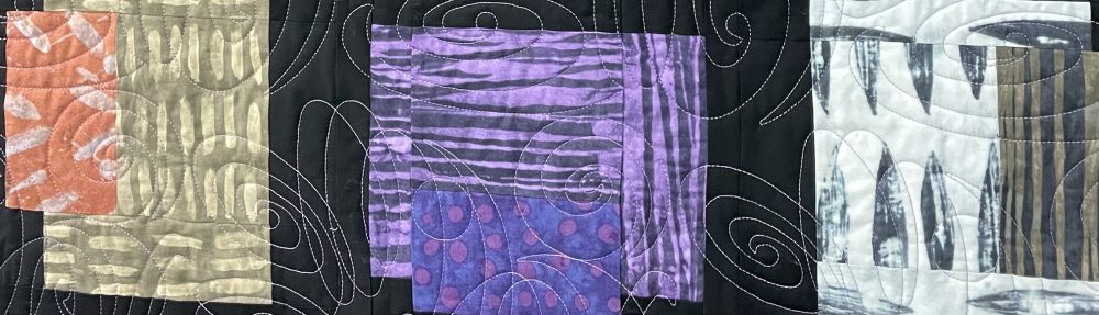
Yesterday I quilted 3 charity quilts for the Great Lakes Heritage Quilt Guild. I want to share some photos of the tops that were pieced by the Charity volunteer workers. Many of these get finished and returned to the charity committee without being viewed by others and a few get shown during show & tell on meeting night.
Since they often have busy prints the quilting cannot be seen unless up close. I thought the workers might want to see the finished quilts (well, they still needing binding). I’m trying to do primarily the quilting portion & pass them onto the ladies that like to do the binding only.
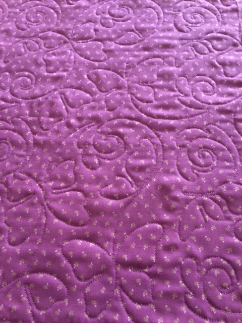
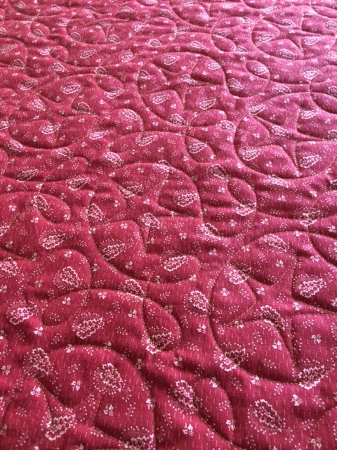
For the first quilt I chose a lavender thread and a butterfly design. It has a lavender backing & boy this thread was a true match for that fabric. Less contrasting thread results in mainly a look with texture.

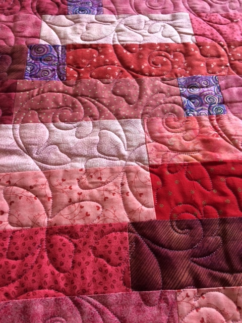
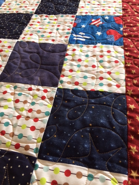
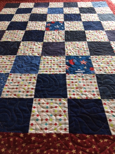
The next two throws are the same quilt with two different star quilting designs. I used a medium color gold thread that went well with the gold in the border print. Each quilt has a different backing. Its a great example for showing the difference you can achieve by using prints or solids & high or low contrasting color threads. The gold nearly blends in on the red print, yet on the muslin it stands out clearly and you can see a stronger contrast in color.


As I weed through my fabric stash in 2017, I’ll be donating more fabrics & partially finished projects to the charity gals who do a great job pulling these quilts together!
